Making pictures of your model railway complicated? Not at all if you’re reading this miniseries. Here I explain how you can take professional photos with (a basic) smartphone and other simple means, suitable for sharing on social media.
In this first part we take a closer look at the theme of perspective. How to incorporate this into the design of your track and apply it when taking photos. Perspective makes it exciting for the viewer.
In this first part we look at:
- The Preiser perspective
- Helicopter perspective
- “Between the trees” perspective
The right perspective
A photo should invite you to look. There must be something to discover and the viewer must feel that he is not overlooking everything. Or looking from a place that is not usual. Like from behind a tree. With depth and perspective you create a photo that captivates the viewer.
The design of your track
To get depth and perspective in your photos, a layout that already offers height differences in the design helps. That does not necessarily have to be a Swiss Alps landscape. In scale N, an inch or two is enough to get depth effect.
In my design, all trains run on the same level. Then the height builds up from front to back. Starting with a small difference in height, of 2 centimeters and eventually the houses on the edge of the city are 15 centimeters higher.
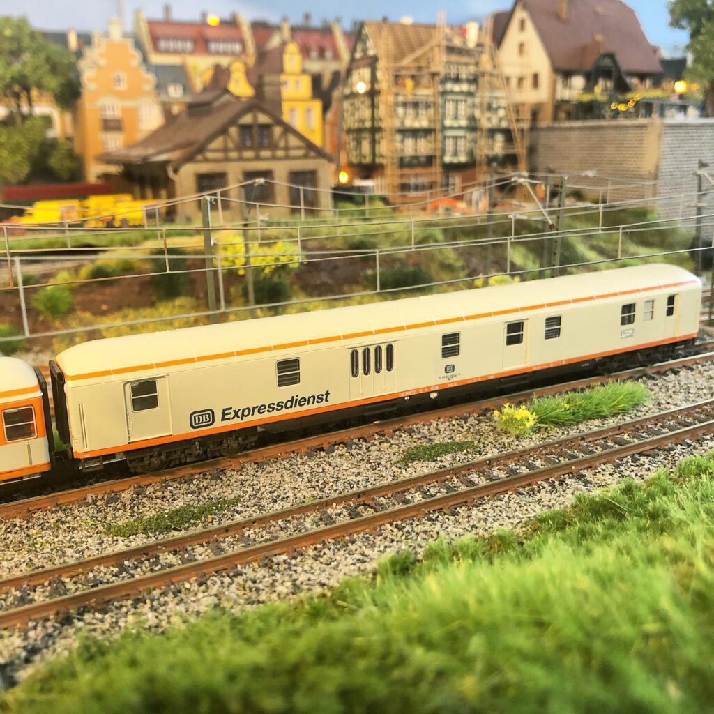
the Preiser persective
The “Preiser” perspective is derived from the Preiser brand. For a long time one of the suppliers of model figures on the train track. They are also affectionately called “Preiserlein”.
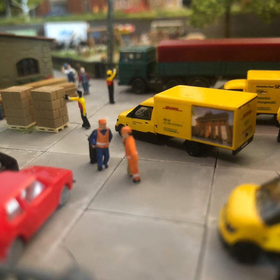
A photo from this perspective means that your phone’s lens is almost level with the figure’s eye level. This is one of the biggest advantages of shooting with your phone. This can easily be placed in between your ‘scenery’. Stay vigilant, because a phone tipped over or tapped against something will have a devastating effect on your Scale N miniature landscape.
the preiser perspective: A locomotive suddenly seems immense and a street endless.
Shooting at Preiser height brings the viewer close to the subject. A locomotive suddenly seems immense and a street endless. In this mode you automatically get a lot of depth in your photo.
But here the limitation of your phone is also literally visible. This will have trouble focusing the entire photo and will therefore focus on a certain part. The rest of the photo becomes ‘blurred’. If you use this effect well, you will automatically create the desired depth in the photo.
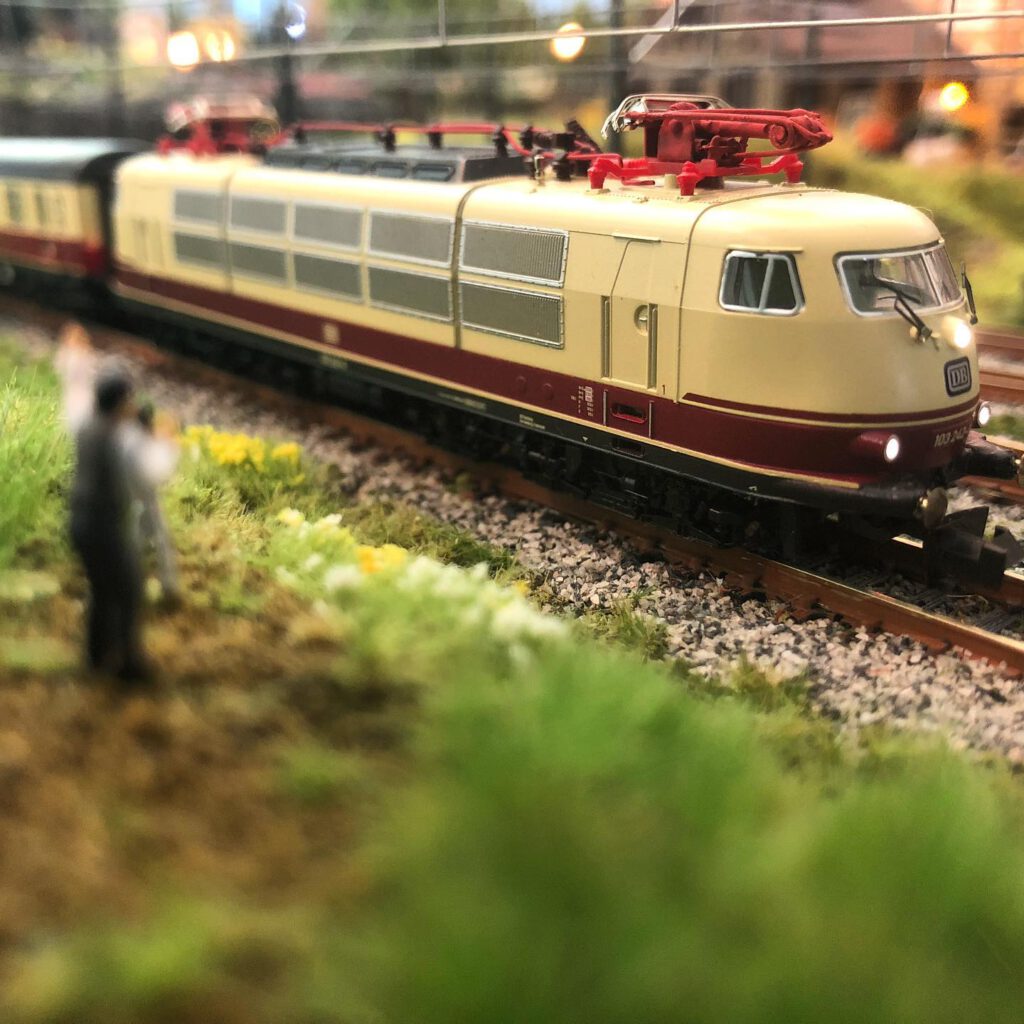
Helicopter perspective
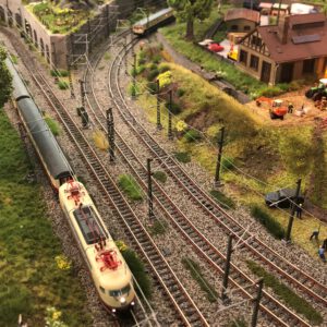
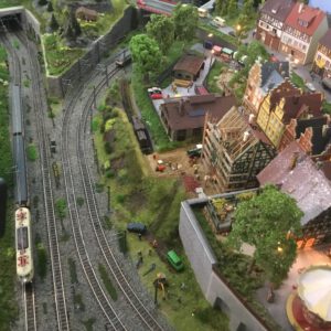
From a helicopter you have an overview of part of the area. You do the same with your camera. Not too high. Here you try to get the perspective of a helicopter hovering over a situation that needs a closer look. Just above the tops of your (tallest) trees on your layout.
Ideally, your layout has a background, so that the messy work table stays out of the picture
Just like a helicopter, you tilt the camera forward a bit. The lens now points obliquely downwards. You can shoot more of an overview and your phone camera can focus a larger area.
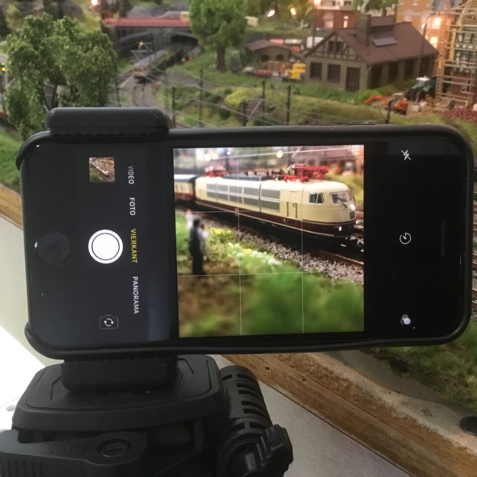
Again, as with the Preiser perspective, do not hold the phone in your hand. You attach it to something so that you are not bothered by vibration and can choose the right position in peace.
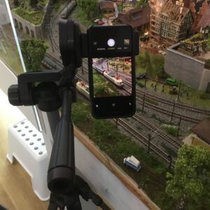
“Between the trees” perspective
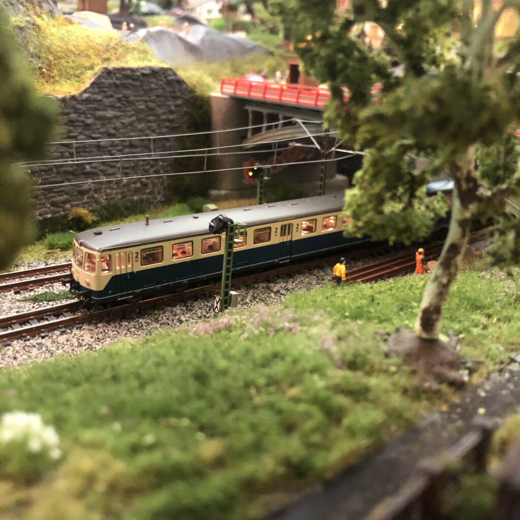
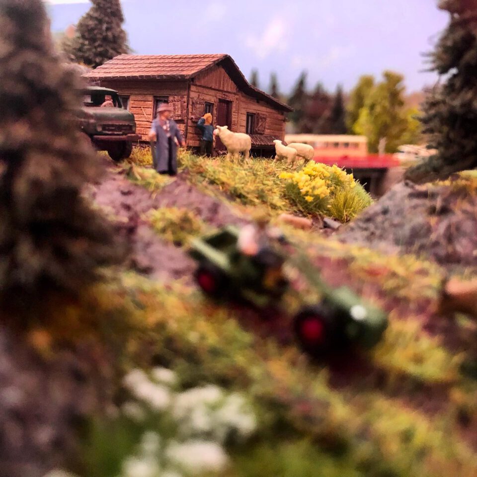
The idea behind this perspective is that the viewer has the idea that he is viewing the scene from the landscape. And just like in reality, objects often obstruct the free view. Like trees, shrubs or even houses. By holding your camera a little bit behind these objects, an enormous depth is created. And the viewer wants to discover more.
Clean up, hide and fill
Check carefully before and after your photo that there is no dirt in the picture. Shots in N scale provide a huge magnification of everything around the photographed object. In the photo, a hair left behind from a brush quickly becomes the size of a thick cable and dust looks like a layer of ash.
The same applies to unfinished parts of your layout. A surface of a few centimeters gives the image of clearing in a photo. Especially from the helicopter perspective. Therefore temporarily place some extra trees to hide these ugly pieces. Or temporarily fill them up with, for example, a (piece of) turf.
Ideally, your layout has a background, so that not only does the messy work table stay out of the picture, but the track also gets more depth. If this is missing, ensure at least an even (white) background.
Share your results on Instagram and mention @123_n_scale in your post.
In part two: required materials
In part 2 of this mini series you can read all about the necessary materials . This series was published in 123 Schaal N Magazine in March. Don’t miss out and take a free subscription .
This article is also available in:
![]() Nederlands
Nederlands


1 comment